"Rooms in Bloom" at the Hill-Stead Museum
Affiliate Disclosure: This page may contain affiliate links, meaning that I receive commissions for purchases made through those links, at no cost to you.
An Honor and a Privilege to Design
for
The Hill-Stead Museum
I was honored to have been selected as one of 13 floral designers to showcase my designs at the Hill-Stead Museum’s “Rooms in Bloom” event last weekend in what was my largest installation to date. After all, I don’t do weddings, and I don’t do funerals!
I created six designs for the house—three for the first floor’s front entry hall and three for the same hall space upstairs. I based my designs on the original gardens of the Hill-Stead, as planned by Beatrix Farrand. I used, in the end, 14 flowers original to the property and was thrilled to find historically accurate colors, as well. I’ll post photos of several of my designs below and explain my thinking behind each piece. But first, a bit of history on the Hill-Stead and the treasures it holds.
HILL-STEAD HISTORY IN A NUTSHELL
A gorgeous Colonial Revival home sited on approximately 150 acres of rolling hills in Farmington, CT, the Hill-Stead is a National Historic Landmark that first began to take shape in the mind of its architect, Theodate Pope Riddle, when she was in her early 20s and a recent graduate (or “Ancient”) of Miss Porter’s School (also known as “Farmington” and now, in addition to “Farmington”, “Porter’s”).
The Hill-Stead Museum, front facade. Facade modeled after that at Mount Vernon, the home of George Washington. ©SageRoss, WikiMedia.org
The Hill-Stead is fascinating for several reasons. First, it was the project that launched Theodate Pope’s (later to become Theodate Pope Riddle upon marriage) architectural career. Theodate envisioned Hill-Stead as a combination New England farmhouse/country estate suitable for highlighting the extensive collection of Impressionist art that her parents (her clients for this project) would bring to the house on the hill. The size and scale of the house, together with its magnificent Beatrix Farrand designed gardens of a bit later date, suggest country estate (33,000 sq ft), while the white clapboards, the louvered shutters, the stone walls, the meadows and trails, the farm animals and the several “outbuildings” are decidedly New England farmhouse inspired. And in a nod to my favorite state, soon after completion of the house, Theodate added a grand facade modeled after Mount Vernon, George Washington’s home and a place I visited often as a little girl, as my father (Robert S. Roberson) served on the Virginia Governor’s Board of Visitors to Mt. Vernon. (In case you were wondering where my love of historic houses might have originated…)
In addition to its being Theodate’s first large scale architectural project, the Hill-Stead was also notable (and this point should be celebrated more than it is, in my opinion) because Theodate was not yet licensed as an architect when the house was built. She was a student apprentice and she had distinct ideas of exactly what she wanted for her parents’ house. She took her drawings and sketches to McKim, Mead & White and hired them to translate her sketches and her vision into finished drawings from which the home could be built. But here’s the best part of her working relationship with McKim, Mead & White: Theodate told the firm on no uncertain terms that the house that would be built from her designs and vision as executed by their plans would be a Theodate Pope house, NOT a McKim, Mead & White house. I think that’s the coolest part of the entire story behind the Hill-Stead. That a woman in 1898—and one not yet with the credentials equal to those of her male colleagues—would be so bold, so self assured and so forward thinking makes me proud. I think it’s something that happens to young women when they attend Miss Porter’s School. Because my 20 year old daughter, an Ancient of MPS like Theodate, is also bold and forward thinking in ways that I can still only hope to be!
NOW FOR THE FLOWERS!
Makeup free, exhausted and with a fake “smile”, here I am in an obligatory “take a photo with at least one of your designs” snap. This was my first design, and it sat by the front door on a marble topped table original to the house. By this time on Sunday, our designs had been in the climate controlled (ie, no real air circulation!) environment for just over 48 hours. We all experienced some wilting, but overall, considering my designs’ 90 mile trek to the Museum from Boston, and considering that the designs were done in oasis (to prevent any problems with water spilling onto any original furniture or other part of the house), I thought these guys made it through in grand style. You can see the purple anemones in this arrangement—they were inspired specifically by the Manet in the drawing room behind me. The rest of the colors in this particular design were inspired by the other Impressionist paintings in the drawing room and throughout the house. ©betsygibsondesign
My first design for the museum was for the front entrance hallway. I wanted to do something large in scale to mirror the size (width wise as well as in terms of height) of the space and to tie together the Impressionist art that could be found behind my piece in the drawing room. Specifically, I was inspired by Monet’s works Grainstacks, White Frost Effect 1889 and his 1888 View of Cap d’Antibes, as well as by Manet’s The Guitar Player 1866 and Edgar Degas’ pastel The Tub 1886. I drew from each of these works in creating the color palette for my main entryway design. The bright blue/purple anemones that you see were inspired by the ribbon in Manet’s subject’s hair.
A FEW OF MY OTHER DESIGNS FOR THE MUSEUM
Parrot Tulips, White Lilac and Stock. ©betsygibsondesign2019
The image above, containing parrot tulips, white lilac and stock (and, of course, done in oasis) is probably my favorite arrangement. While I have tried to highlight for you the movement and the shapes and the textures of this design, I fear that my photo editing skills fall short of the mark. I may, in fact, have made the photo more difficult to see. Oops. But I think you get the idea. When I finished with this design, it actually reminded me—in form—of the 1876 Degas painting Dancers in Pink. To me, this design looks like it’s a ballerina in mid-lift. The curves, the swaying of the different elements in different directions yet also in harmony with one another. In fact, the inspiration behind this arrangement was the garden that was just behind these flowers, which sat on a low window sill on the landing of the second floor. The window overlooked expansive green and even a bit of the sunken garden. So my hope was to bring a piece of the garden into the house. With all of this green and white, I think it was mission accomplished!
MY TAKE ON A WHISTLER LIKE NO WHISTLER I HAVE EVER SEEN…
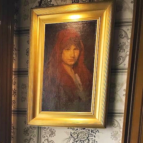
My interpretation of J. M. Whistler’s 1895 painting Carmen Rossi. (see next photograph) ©betsygibsondesign
The subject of the above floral interpretation. J. M. Whistler’s Carmen Rossi, c.1895.
This arrangement was great fun to do. With this piece, I deviated from the Impressionist palette so that I could interpret the work above these flowers, which themselves would be placed on a pembroke table next to the front door. I interpreted a work by James M. Whistler, one of over 20 in the Popes’ collection by the artist. However, the particular painting that these flowers interpret is like no other Whistler of which I’m aware. I’m not an ARTH major, but I do know a few things about art…Take a look at the florals and at the inspiration painting. How did I do? ©betsygibsondesign
BRIGHTENING UP THE SECOND FLOOR HALLWAY: A MODERN TWIST
I’m not sure what possessed me to create anything modern for the Hill-Stead, but as soon as I thought about what needed to go into the main spot upstairs—with the main spot being on a big round table at the front of the house and viewable from all angles—I decided that I needed something simple, yet exotic, and something that would liven up the space, which, unlike the first floor with its wide open views of other rooms and colorful art, could be closed off by all of the bedroom doors. And since the second floor’s art consisted mainly of prints, including some incredible Japanese woodblock prints, I needed a real focal point. Color was lacking upstairs, and so I thought I’d just bring some in! I decided upon using Fritillaria and Eremurus (Foxtail Lily or Desert Candle). Fritillaria are a favorite of artists because of the unique way in which they hang (upside down) and because of their interesting colors. I chose orange to complement the cream and brown wallcovering. The flowers looked gorgeous with the lighter orange/yellow Eremurus. And because they were introduced to Europe in the 1500s, I thought that gave them significance to the second floor, as that is where some of Theodate’s things from her Grand Tour are housed. Granted, she wasn’t touring Europe in the 1500s, but I wanted to tie the flowers into their environment, and location (as shared with Theodate, even centuries apart!) was the key with the Fritillaria. Unfortunately, one of my stems decided that it wanted to droop a bit just as we were getting ready to leave Boston. So the photo below shows what happens when you realize that you are dealing with elements from our natural world. And yes, I brought the arrangement just like you see it in the photo right into the Hill-Stead, where it proceeded to droop a bit further, at which point I just put it behind its better behaved siblings.
Behind the scenes. Works in progress before we left for The Hill-Stead. I always take photographs so that I can see where there are holes, gaps, broken stems or the like. Here, I discovered that I needed to adjust some of the Cherry branches and add some more Viburnum. (It would not be the last time I had to add Viburnum to the left side of the arrangement!!) You can see the Fritillaria and the Eremurus to the left of the main hallway arrangement. The bloom on the far right of the arrangement is the one that didn’t want to behave…©betsygibsondesign
EVEN WITHOUT FLOWERS, THE HILL-STEAD IS FANTASTIC
See—The house, the art and the grounds, including the Sunken Garden.
Learn—About the architect who blazed a trail ahead of her time, as well as about her family and friends.
Experience—One of the few places in our country that remains today—with the entire house, including furnishings and decorative arts—exactly as it was in 1901.
Enjoy—The many amazing community programs the Hill-Stead offers. Become a member and support this valuable historical and cultural institution!!
LET ME KNOW IF YOU’RE PLANNING A TRIP…
I never tire of the Hill-Stead or of Farmington, CT. I am a happy “plus one” on any tour that the Hill-Stead has to offer!


